Design
Design is an integral part of storytelling. Visual communication is what grabs a reader's attention, pulling them in closer to take a look at our stories. Throughout my journalistic career, I have stressed the importance of eye-catching design and clearly organized information in my publications. As a middle schooler, I taught myself how to use Adobe InDesign and Illustrator to create elegant pages and dynamic infographics. After I mastered creating illustrations on Adobe Illustrator, editors on my staff began coming to me to create personalized drawings for their pages. As I continue to develop my design skills through the years, I emphasize the important of strong design in news publication to my staff members.
Redesigning The Hoofbeat
Every few years, The Hoofbeat undergoes a radical change in appearance. This year, my Co-Editor-in-Chief, Christina Youn, and I decided that it was time. During the summer before the 2016-2017 school year, Christina and I spent countless hours redesigning the entire look of the print publication of The Hoofbeat. Our primary goal was to modernize every aspect of the paper. We shifted to sans serif fonts, bold headlines, wide columns, and clean alignments. After experimenting with many different colors schemes, graphics, and flags, we settled on a look that captures the traditional elements of The Hoofbeat in a contemporary fashion.
|
Design Library
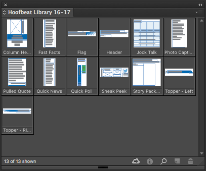
One of the most important parts of the designing process was finding a way to ensure consistency throughout the paper. After Christina and I settled on things like how headlines should be formatted, which fonts should be used in infographic, or how much space belongs between stories, we created a library of tools in The Hoofbeat shared drive to help our page editors abide by our new style. |
|
Fonts and Theme
We changed the color palette of the paper to simple shades of blue and black, whereas our old paper had supplements of green. One color allows us to keep an elegant design in our graphics. We changed the shade of blue as well because we learned from prior years that a darker blue is more likely to print as purple. We also emphasized vertical and horizontal lines (headlines, quick updates, pull-quotes) to create an aligned visual effect. Triangles were a repeating theme in our front page flag as well as the top liners on each page.
We changed the color palette of the paper to simple shades of blue and black, whereas our old paper had supplements of green. One color allows us to keep an elegant design in our graphics. We changed the shade of blue as well because we learned from prior years that a darker blue is more likely to print as purple. We also emphasized vertical and horizontal lines (headlines, quick updates, pull-quotes) to create an aligned visual effect. Triangles were a repeating theme in our front page flag as well as the top liners on each page.
Front Page
We created a new flag with a contemporary style, while maintaining the original white-on-dark text pattern. We also enlarged our sneak peek boxes so we could provide better insight to stories in the paper. The “Network With Us” information is moved to the bottom of the page with a clear twitter bird because our social media and online presence has increased this year.
We created a new flag with a contemporary style, while maintaining the original white-on-dark text pattern. We also enlarged our sneak peek boxes so we could provide better insight to stories in the paper. The “Network With Us” information is moved to the bottom of the page with a clear twitter bird because our social media and online presence has increased this year.
|
Redesigned Front Page
Dec. 19, 2016, Issue 4, The Hoofbeat 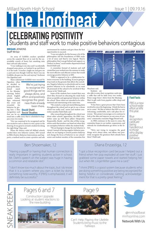
|
Old Front Page
April 21, 2016, Issue 7, The Hoofbeat 
|
New Elements
Hover over the black dots on the images to read about the new and improved additions that we added to The Hoofbeat.
Hover over the black dots on the images to read about the new and improved additions that we added to The Hoofbeat.
|
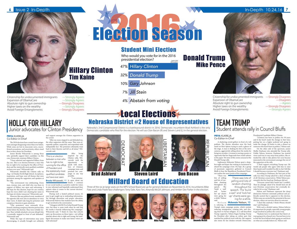
Redesigned Opinions Page
Oct. 24, 2016, Issue 2, The Hoofbeat  |
Redesigned News Page
Oct. 24, 2016, Issue 2, The Hoofbeat  |
Graphic Design
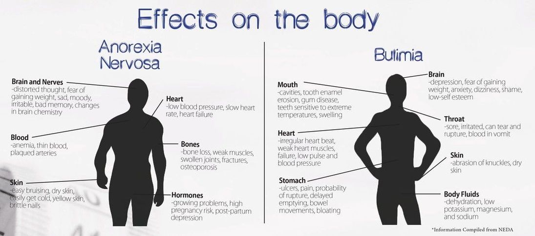
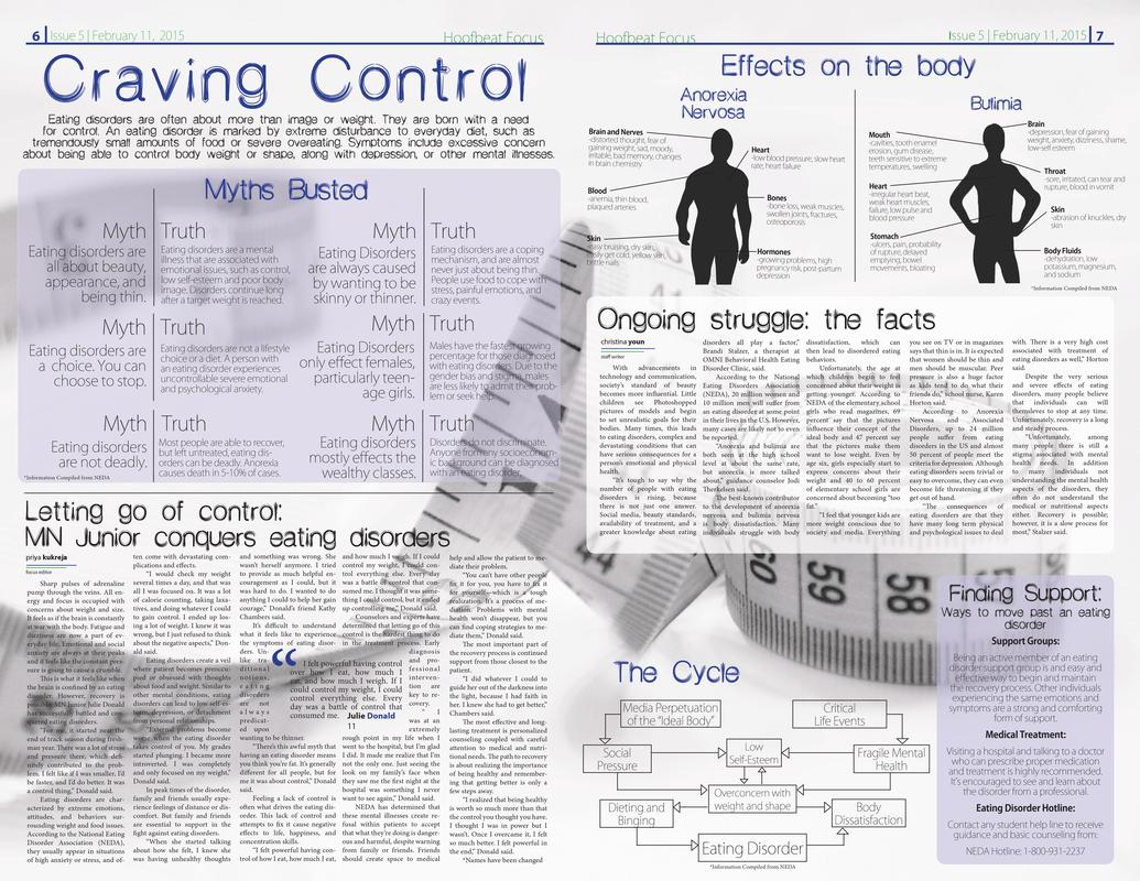
As part of our eating disorders special coverage, I created a contrasting visual between black silhouettes and white space to illustrate the effects of anorexia nervosa and bulimia on the body.
Published in The Hoofbeat on Dec. 19, 2016.
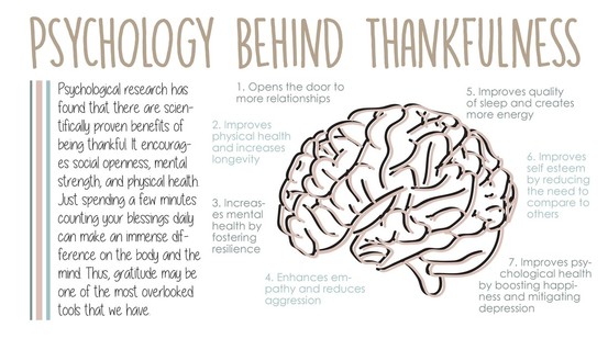
In order to make information about psychology easier to read, I used Adobe Illustrator to draw a three-dimensional brain that adds depth to the text.
Published in The Hoofbeat on Nov. 16, 2016.
|
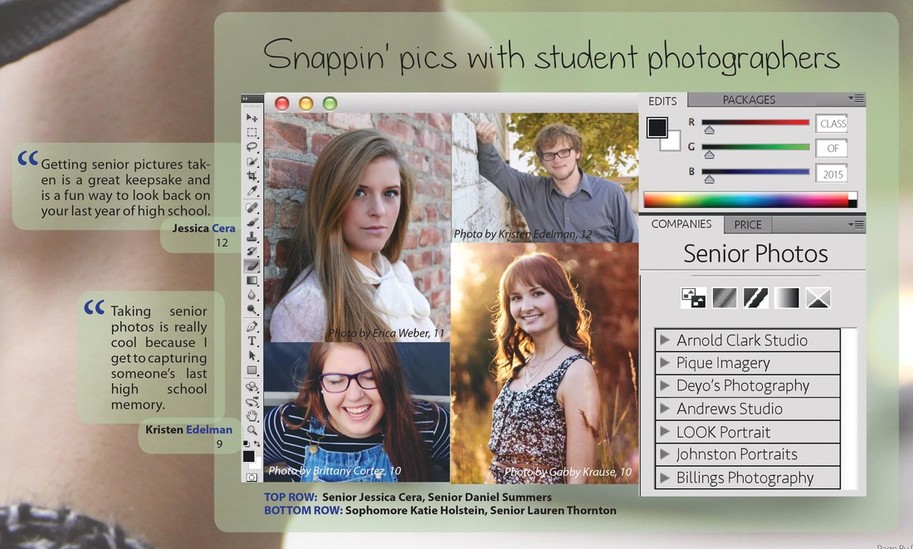
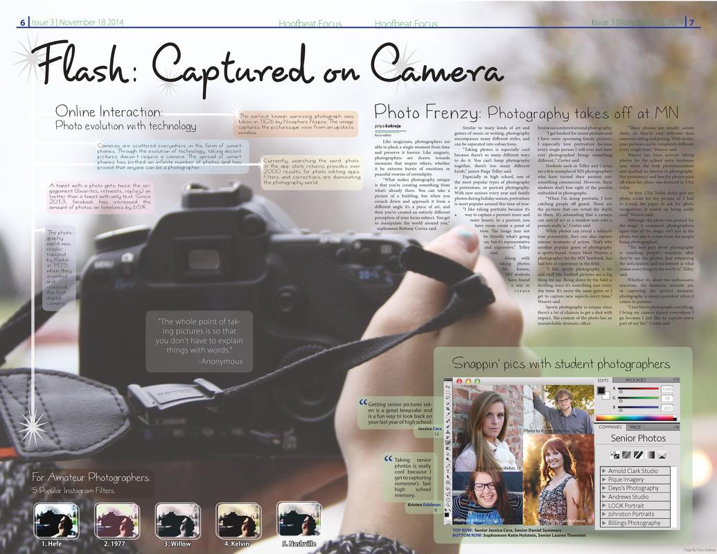
This photo illustration uniquely combines information about senior photographers, portrait studios, and student quotes with actual photos in order to display the various phases of the photography process.
Published in The Hoofbeat on Nov. 16, 2016.
NSAA 2015 State Journalism Qualifier and JEA 2016 Winter Contest Superior Award in Photo Illustration.
NSAA 2015 State Journalism Qualifier and JEA 2016 Winter Contest Superior Award in Photo Illustration.
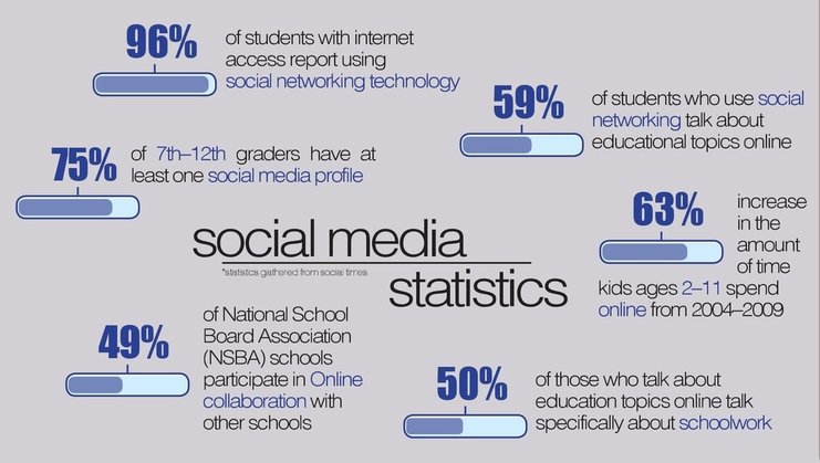
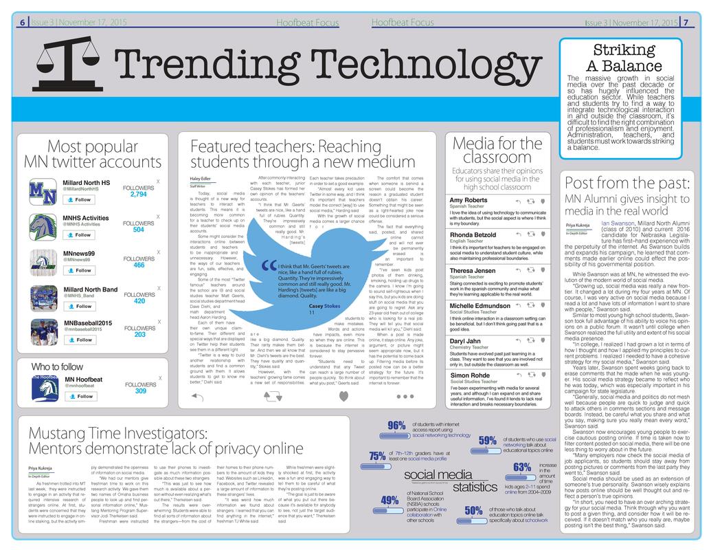
This infographic utilizes large numbers and correlating tubes to represent quantifiable statistics to visualize social media trends.
|
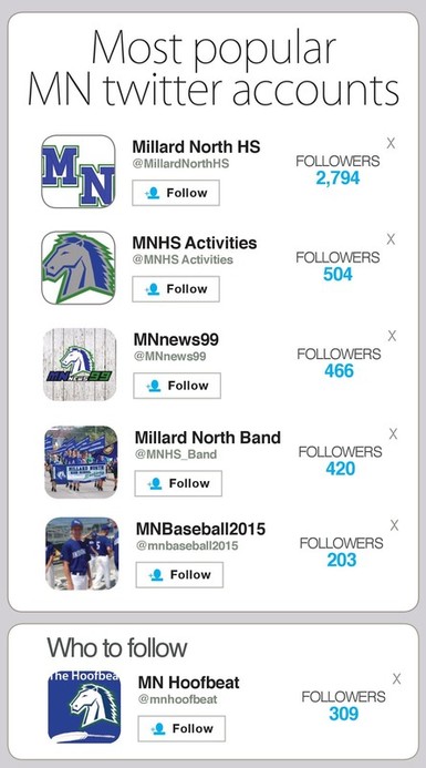
I recreated the design from Twitter's personal followers layout to represent every Millard North account and its follower base.
|
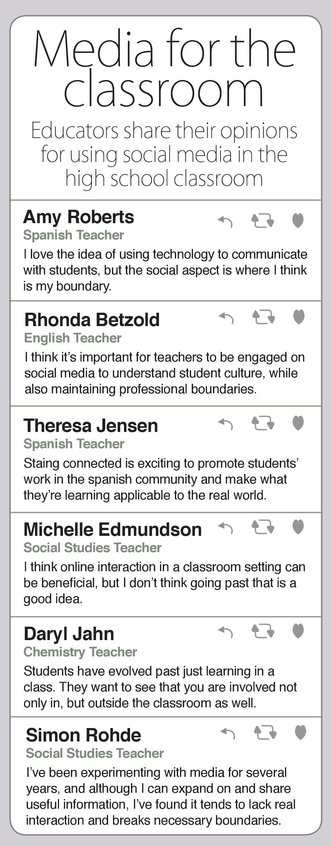
By paying extra attention to detail, I recreated a Twitter news feed where each individual "tweet" is a quote from a teacher.
|
Published in The Hoofbeat on Nov. 17, 2015.
JEA 2016 Winter Contest Honorable Mention in Layout Design.
JEA 2016 Winter Contest Honorable Mention in Layout Design.
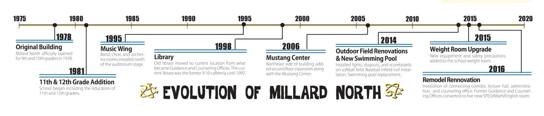
I pursued administration at my school to gather information about each construction or improvement project that took place in our school since it first opened in 1975. Then I created a timeline with well-spaced information to make it visually accessible.
Published in The Hoofbeat on Sept. 19, 2016.
JEA 2017 Winter Contest Superior Award in Newspaper Layout.
JEA 2017 Winter Contest Superior Award in Newspaper Layout.
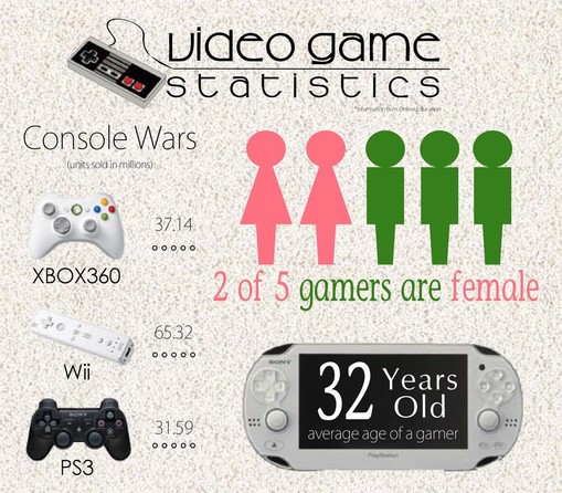
By using a variety of different data visualization techniques, I presented multiple statistics about gaming in an aesthetically appealing way.
|
Published in The Hoofbeat on Oct. 14, 2014.
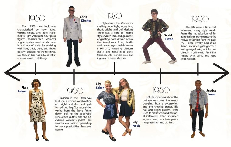
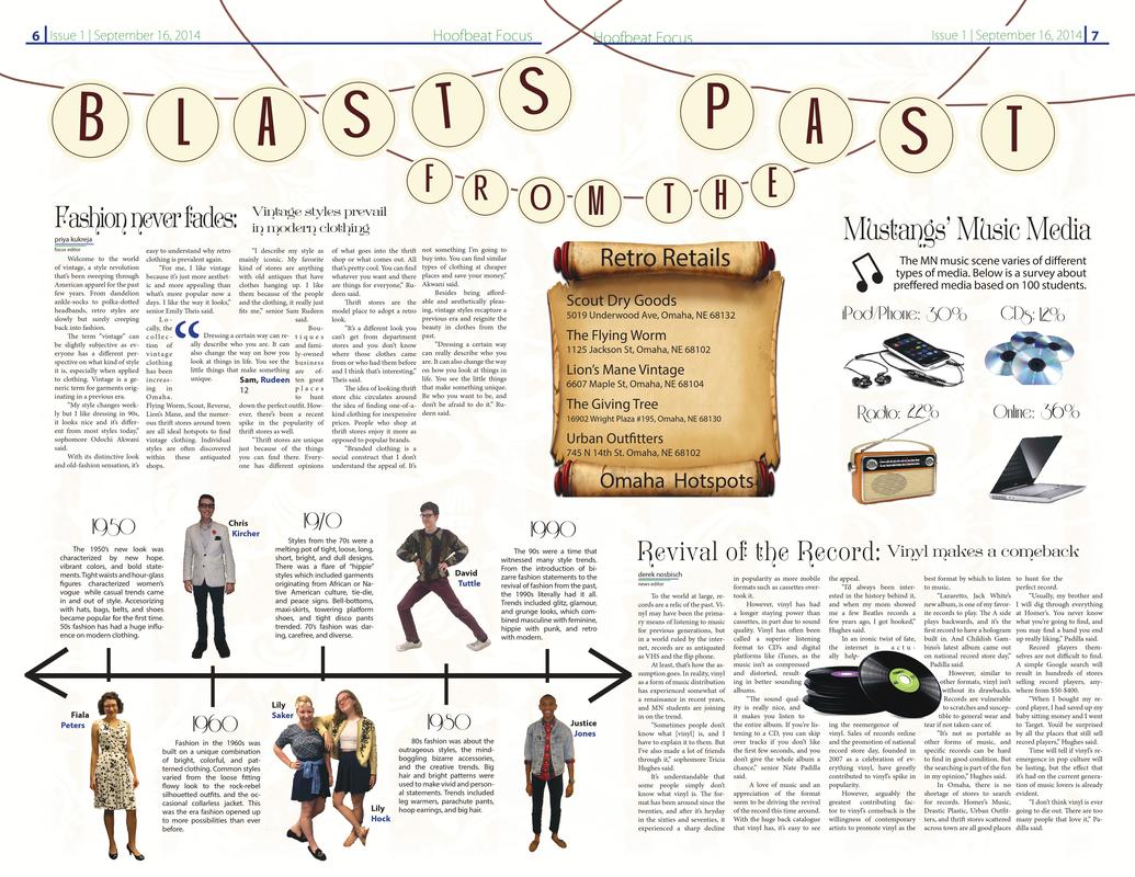
By creating a timeline of the evolution of fashion, I was able to incorporate facts about fashion from different decades matched with student fashionistas all in one graphic. I paid extra attention to alignment and clean cut-outs to ensure that this graphic is elegant.
Published in The Hoofbeat on Sept. 16, 2014.
JEA 2015 Winter Contest Superior Award in In-Depth Coverage.
JEA 2015 Winter Contest Superior Award in In-Depth Coverage.
Editorial Design
As in-depth page editor, my spreads are different from conventional newspaper layouts. Since I have more freedom to get creative, I have to find unique ways to incorporate different types of information. My process starts with gathering the information I want to include and creating a rough sketch. The most important part is coming up with a theme, a dominant graphic, or a consistent design to unify the whole page. After taking many photos, downloading various fonts, and creating illustrations on Adobe Illustration, I implement my vision on Adobe InDesign until it transforms into an elegant and accessible page.
Click on images to enlarge. Hover over images to read descriptions.
Click on images to enlarge. Hover over images to read descriptions.